Visual identity redesign & new opportunities for a B2B company
I have updated the Bezpečný vzduch (meaning Safe Air in Czech) brand’s visual identity. The objective was to modernize the brand and appeal to the more discerning B2B segment.
Bezpečný vzduch redesign
Disciplines
visual identity
redesign
web design
print
Client
Studio
Heels Make Deals
Year
2022
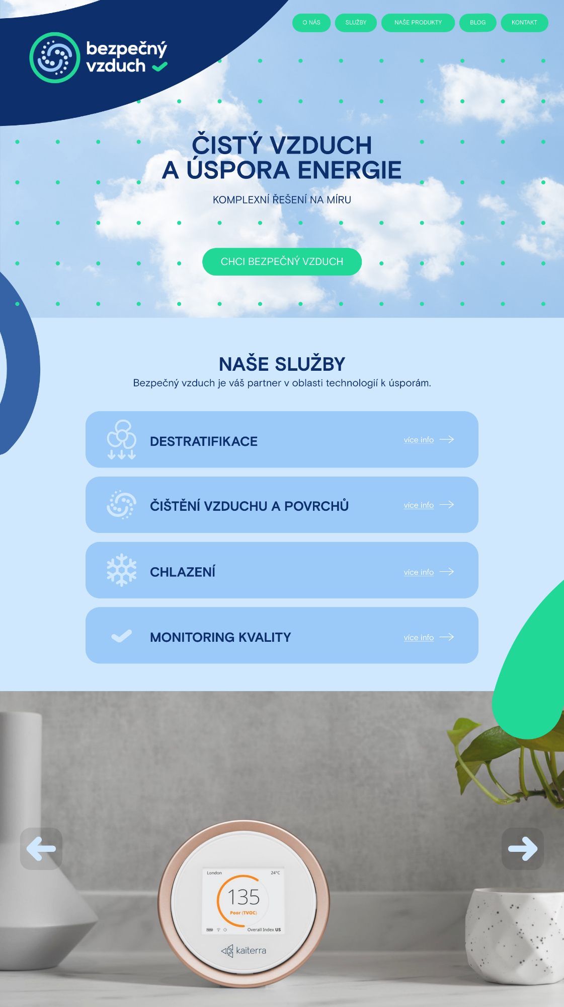
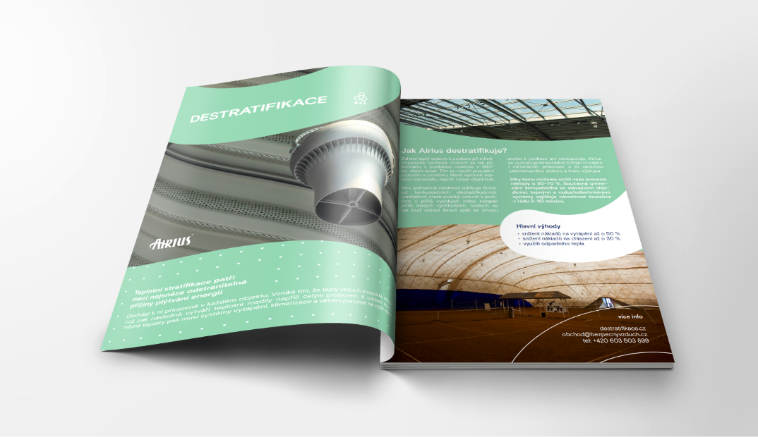
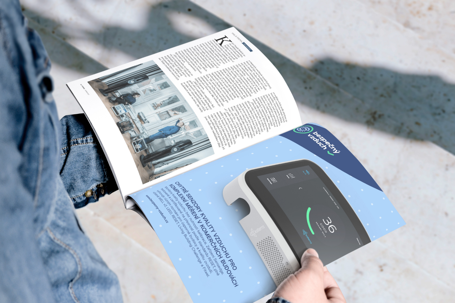
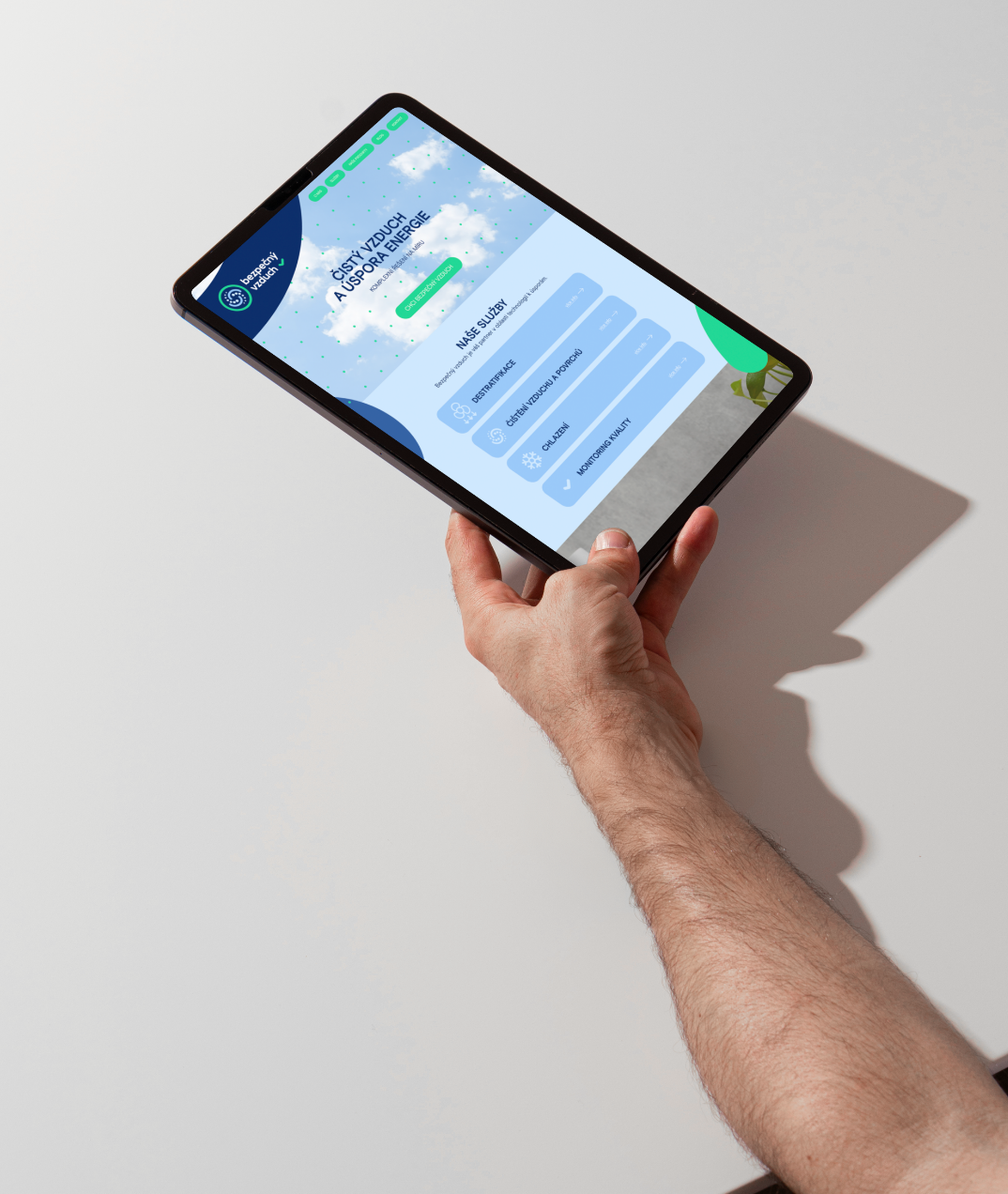
The updated visual style provides a modern, polished look that allows the brand to effectively engage with commercial clients.
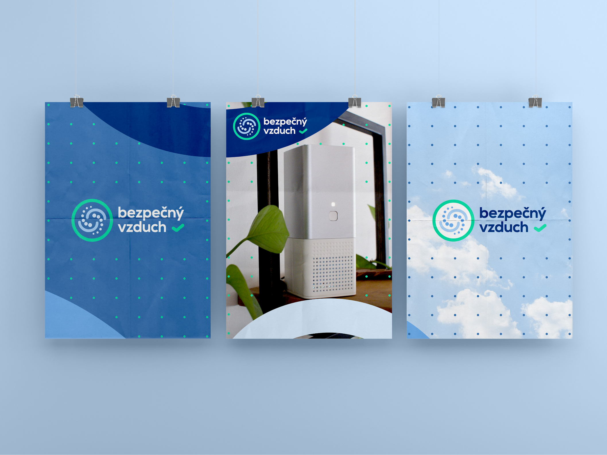


Based on a sense of trust and security
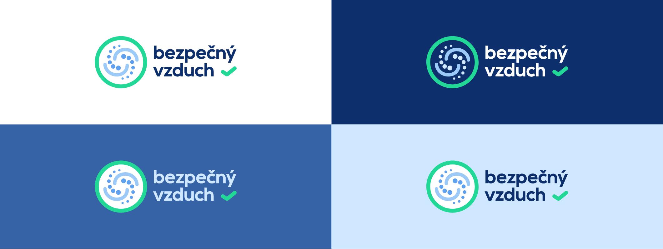
The color palette, consisting of shades of blue and green, evokes feelings of cleanliness, security, and trust. The selected hues create a modern, professional, and reliable palette, while maintaining a fresh aesthetic that avoids a corporate feel.
The visual motif of air molecules embodies the brand’s main idea and emphasizes its focus on air quality. The dynamic lines emerging from the logo add energy and flexibility to the visual.
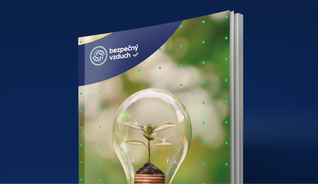
As part of the Heels Make Deals studio, I co-created a new circular logo symbol that represents air cleaning with an accompanying icon. It also functions as a certification mark of quality and safety with which clients can mark a building using a solution from Bezpečný vzduch (meaning Safe Air in Czech).
